Основная вещь, которую следует знать о трендах — это то, что они постоянно меняются. Тенденции в области сайтостроения также весьма быстро сменяют одна другую, поэтому веб-дизайнерам порой бывает очень сложно «угнаться за модой».
По данным статистики, 75% пользователей признались, что они определяют степень надежности фирмы, глядя на то, как спроектирован ее сайтлендинг. При этом нужно иметь в виду, что любое изменение может повлиять на эффективность бизнеса в целом.
В этой статье подобраны 10 основных трендов в области веб-дизайна посадочных страниц на 2016 год. Следуя им, вы сможете повысить эффективность своего ресурса.
№1: Четкий и персонализированный призыв к действию
Единичный призыв к действию, который выглядит как кнопка и всегда находится на виду у пользователя, поможет вам увеличить количество лидов. Если кнопка с целевым действием будет размещаться в шапке или подвале лендинга, то позаботьтесь о том, чтобы ничего не отвлекало внимание пользователя. Таким образом вы сможете увеличить конверсию.

Настоятельно рекомендуется в качестве призыва к действию использовать не более 5 слов. Кроме того, нужно, чтобы сама кнопка выделялась на общем фоне страницы. Для этого лучше подбирать контрастные цвета. Это поможет привлечь внимание пользователей.
№2: Анимированные элементы или встроенное видео на заднем плане
К применению этих элементов следует относиться с умом. При правильном использовании они помогут повысить узнаваемость вашего ресурса, а также завоевать доверие посетителей. CSS или анимированные переходы добавят элегантности вашему лендингу. Однако чрезмерное использование видео и анимации — это потенциальный риск с точки зрения внимания. Не стоит этим злоупотреблять.
№3: Респонсивный дизайн
На сегодняшний день превратился в своеобразный стандарт. Это стало так важно, потому что пользователи часто просматривают сайты при помощи различных мобильных устройств, а не только на своих компьютерах и ноутбуках.

Респонсивный дизайн обеспечивает правильное отображение лендинга на всех видах устройств, как показано на изображении выше.
№4: Упрощенная навигация по сайту
Если говорить обобщенно, то пользователи с большей вероятностью будут совершать конверсию, если смогут быстро и просто найти то, что им нужно. Четкость и простота — это ключевые составляющие успешного лендинга.
В настоящее время навигация на многих сайтах упрощена: в главном меню отображены только основные опции. Дизайнеры стремятся избавиться от ненужных элементов, занимающих «драгоценное» пространство на странице. К «лишним» относится, например, значок «Перейти на домашнюю страницу».
№5: Большие изображения
Вместо того, чтобы размещать у себя на сайте множество мелких картинок, используйте одно большое изображение (hero image). Это поможет улучшить пользовательский опыт.
Кроме того, уменьшение количества картинок увеличит скорость загрузки сайта. Вы сможете более эффективно донести нужную информацию до пользователей.
№6: Привлекательный минимализм
Как уже было упомянуто выше, современным людям важно найти нужную им информацию как можно быстрее. В связи с этим, в дизайне сайтов начинает преобладать минималистический подход. Минимализм наблюдается также и в оформлении текстов — гарнитура шрифтов постоянно упрощается.
№7: Элегантный и изысканный внешний вид
Множество дизайнеров в настоящее время следуют этой простой формуле при создании лендингов. Эта тенденция — нечто большее, чем просто минимализм. При таком подходе дизайнер уделяет особое внимание визуальной эстетике.
№8: «Кирпичная кладка» и модульное расположение элементов на странице
Что касается расположения элементов на странице, самыми последними трендами являются:
- Masonry - вывод html-блоков в виде кирпичной кладки;
- Mosaic - тренд, определяющий внешний вид современных браузеров. На странице содержится меню, панель инструментов и строка поиска;
- Модульное расположение элементов, основной принцип которого можно кратко выразить как «от меньшего к большему».

№9: Динамическая персонализация
Динамическая персонализация является одной из ключевых составляющих успешной стратегии входящего маркетинга. Она учитывает различные сегменты аудитории и предлагает пользователям контент в зависимости от их потребностей, а также от того, на каком этапе совершения покупки они находятся.
Например, вы можете направлять всех ваших потенциальных клиентов на одну посадочную страницу, а партнеров - на другую. В таком случае вы сможете предоставить каждому из сегментов целевой аудитории релевантный контент.
№10: «Исчезающий» контент
При помощи JavaScript или CSS можно создать на сайте контент, который будет появляться или исчезать в зависимости от потребностей пользователя.
Бонус: Оптимизация дизайна ради увеличения скорости загрузки сайта
Медленно загружающиеся сайты раздражают пользователей. У вас есть всего лишь 5 секунд, чтобы заинтересовать посетителя. Даже 1 секунда промедления может стоить вам конверсии.

Используйте самые новейшие приемы, чтобы своего лендинга. Это так важно, потому что, согласно данным статистики, пользователь покидает сайт, если время его загрузки превышает 4 секунды. Это исследование было проведено в 2014 году, и можно предположить, что этот показатель уменьшился еще сильнее с тех пор.
With the purpose of saving you time and effort on the creation of a landing page, we have decided to share this compilation of 30 responsive landing page templates , which are ready to go, out of the box. Some of them were even enhanced with live drag-and-drop builders, which will make your web development much faster and worry-free.
Look through the list, maybe your perfect landing page design is included here?
1. Mobile Repair Service (Page builder included)
This fully responsive landing page template was built in a clean, flat style, which allows you to bring your content to the forefront. Bold colors and retina ready images make it easier to separate different content blocks from one another. Readable typography and bold headlines provide for better readability on the page.
Best suited for entertainment and holiday planning web pages, the template looks really impressive. An abundance of high-quality images create a festive atmosphere on the page. Neat icons and readable fonts make it easier for the web audience to scan your content and understand your objectives. It’s one of the most stylish landing page templates by TemplateMonster .
3. Education (Page builder included)

The header of this landing page template welcomes visitors with a simple sign-up form. The clean layout has been enhanced with the smart use of white space, providing for better readability of your content. Flat icons and clear pricing details guide the users through the basic education programs that you provide. The theme is fully integrated with social media, which frees you from the necessity of manual installation of third-party plugins.
4. Real Estate (Page builder included)

This landing page template is intended for effective presentation of your latest projects and new offerings on the web. A large hero area, integrated with blurred video background, serves as a great attention getter. Neat icons added on top have been enhanced with hover effect. Photo galleries, built-in contact form and Google map support are intended to provide the web audience with explicit information about your business.
5. Financial Advisor (Page builder included)

Financial, business and accounting projects can benefit from this professionally built landing page template. If you have loads of content that you would like to present in a logical and well-balanced way, then the clean and concise layout of this financial advisor landing page template is just what you need. Fully customizable, responsive and crossbrowser compatible, it will present your business in a most favorable way.
Special Offer (Expires on May 20, 2016)

Each of the aforementioned 5 landing page templates is available for $19, but the good news is that these five templates are included in one bundle , which you can download for as low as $39 by entering a coupon code LANDING .
Important: the coupon code will expire on May 20th, 2016.
By the way, each template in the bundle is pre-loaded with a drag-and-drop builder, which helps you tweak the layout without touching a line of code.
6. Car Repair

This fully adaptive landing page template has been pre-loaded with a number of smart customization options, which will help you get started in no time. HTML plus JS animation will help you create a truly remarkable web presentation. Parallax scrolling background and lazy load effect will not only enhance your page’s visual appeal, but also speed up its loading.
7. Hotels

The functional yet effective look of this theme will fit hotels, travel, real estate, exterior and interior design web projects perfectly. Scrolljacking technique, which was integrated into this template, makes it both trendy and user-friendly. The users do not need to scroll up or down the page in search of desired content. Instead, they can reach any sought after data with just a click.
8. Construction Company
Non-standard layout of this theme and eye-catching color palette will appeal to every visitor. The theme’s framework is highly adaptable and can adjust flawlessly to any screen size on which it is being viewed. Packed full with multiple customization options, the theme is also very versatile – you can pick it for any project that you have in mind.
9. Home Repairs

Maintenance service companies can create a professional business image on the web by means of this well-coded landing page template. Flat style makes the page easy to scan. While directing the main focus on content, the theme’s developers enhanced the layout with handy booking and contact forms.
10. Flooring

Creativity and style – this is how the template can be described in two words. In fact, the layout has been created in a way that will exude professionalism and a non-standard approach to your interior design company. Images and texts make up a perfect balance on the page, letting users enjoy your creative works while running through the easy-to-follow texts.
11. Business

A sticky menu in the template’s left sidebar facilitates the page’s navigation to a great extent. Providing the users with a quick overview of all the key pieces of content that you share, it also allows your visitors to navigate to any desired information with a click. A built-in contact form has been added to the theme’s header, inviting every visitor to reach out to you for more details.
12. Corpexa

Professionally designed and built with clean, valid code, this business landing page template demonstrates usability across a variety of devices. Equipped with a usable admin panel, the theme also features a variety ofadvanced customization options, which will make it easy for you to adapt the template to your specific needs. Google web fonts, online chat and subscription form have also been added to the pack.
13. Medical

Easy-to-reach contact details and an integrated contact form, easy to scan content, user testimonials, and a list of programs – this landing page template features everything that you need to build trust and attract the web community. The vivid red color scheme is a great attention getter, which evokes curiosity and a thirst for new information.
14. 87 Landing Theme

Breathtaking animation makes this business landing page template more spectacular. Though the color scheme of the layout looks traditional for this type of web project, the parallax scrolling and hover effects that appear as you move your mouse on the page, simply cannot leave anyone indifferent. Enumerated content blocks provide for better page readability.
15. Dance Studio

This responsive one-page template will work well for representing dance, sport, adventure and travel projects on the web. Rich in visuals, it captivates the users with storytelling. The main navigation panel remains fixed to the top of the page, letting the users navigate to any content with a click. Thanks to the integration of lazy load effect, the users will enjoy the speed of your page’s loading on any device.
16. Psychologist

The calm and relaxing atmosphere on the page, that was achieved mainly through full-width video integration and pleasing-to-the-eye color scheme, makes it a perfect fit for medical and healthcare websites. Google map integration, as well as easy to reach contact details, make it very easy for the audience to reach you. Social sharing options provide them with a quick way of getting in touch with you through social media.
17. Steelworks

This landing page template is best suited for industrial websites. The clean and concise layout was enhanced with parallax scrolling backgrounds. Rhombic shapes and non-standard content positioning allow you to create a more eye-catching presentation of your company, its products and services. Readable fonts and large headings make the page more user-friendly.
18. IQ Business
Creative and innovative, the template is intended to present your business project with style. Running on a fully responsive framework, it will adjust all content to multiple screen resolutions flawlessly. Developed with valid HTML/CSS practices, the theme is also SEO-friendly, which guarantees you high page ranking in the search results.
19. Bank

The pixel-perfect design of this landing page template, with the integration of flat style elements, will work really well for presenting accounting, financial and business projects on the web. In addition to some quick information about the company, the header has been enhanced with a full-width video background. Making contact is easy to accomplish. To add a feeling of confidence to the presentation, the theme features user testimonials and a list of accepted payment methods.
20. Software

If you are looking for a ready-made solution to present your software project effectively to the web community, then consider the following theme. Metro style enhances its visual appeal. Direct download links were put in the theme’s header, inviting every visitor to try it out on their own. Stunning animation and lazy load effect make the theme more user-friendly. Video integration and interactive photo gallery will help you introduce your offerings to the audience in a better way.
21. Travel Agency

The template was created specifically to present hot tours and beautiful destination points in a captivating way. An integrated booking form was placed in the theme’s header, inviting every visitor to make a quick reservation on the site. Stunning hover animation and parallax scrolling images will get the web audience immersed in the atmosphere of your agency.
22. Real Estate Agency

This fully featured landing page template will work well not only for real estate but also for design and hotel businesses. A photo heavy layout is best suited for presenting this type of content in the most favorable light. Advanced animation, parallax scrolling effect, image hovers and lazy load effect have all been integrated into the package. If you wish to tweak the layout, this can be achieved easily from the theme’s dashboard.
23. Fashion

Fashion studios and creative photographers can use this theme to present their talents to the online community in an outstanding way. A full-width video background in the header serves as a great attention getter. A contact form above it invites every visitor to approach you for details. Clean and minimalist layout with plenty of white space brings the users’ attention to your portfolio.
24. Car Dealer

Full-width photo backgrounds featuring the parallax scrolling effect let web users get into the atmosphere of your business once they land on your page. Scrolljacking effect adds a sense of interactive functionality to the layout. By clicking any of the items in the theme’s vertical carousel, the users will be taken to the various types of content in the blink of an eye.
25. Home Remodeling

This template is ideal for creating landing pages for construction and industrial companies. Clean and concise design adds more professionalism to their online presentation. Valid code and a fully responsive framework will make the page run flawlessly across a variety of devices.
26. Italian Restaurant

The key purpose of any food-related website is to stimulate the appetite of every user who reaches it. For landing pages, this factor is of tremendous importance as well. This Italian Restaurant template has been pre-loaded with mouthwatering dishes on the menu, which demonstrate your refined cuisine at its best. Following your restaurant’s menu, a quick reservation form and integrated Google map allow you to establish contact with your prospective clients.
The clean and professional style of this theme will help you create a trustworthy business presentation on the web. Spacious layout and a neutral color scheme provide for better readability of your content. Though the page is not rich in various types of content, it introduces the users to the key data that they need to know about you – a couple of words about your company story, services and contact details.
29. Cafe and Restaurant

The stylish and elegant design of this landing page template is intended for presenting singers, music bands and other creative professionals on the web. The layout is diverse in multiple types of content. Here you can share a playlist of your latest singles. The theme has plenty of space for sharing your upcoming tours’ schedule and even highlighting some of the top-selling branded clothes.
Final Words
These have been 30 of the coolest landing page template s that we recommend you consider using for creating a stunning presentation of your business on the web. Feel free to try how each of them looks and feels by checking out their live demos.
If you think that there are other cool landing page templates that are worthy of being mentioned in this list, feel free to share your thoughts below this post. Your feedback is highly appreciated!
Рынок конструкторов и редакторов посадочных страниц обширен. Не хотите тратить время на поиск подходящего? В статье вы узнаете о лучших, на наш взгляд, сервисах. Вы прочитали десятки статей и поняли, что нужен лендинг, а может быть, несколько. Открываете браузер и ищете список конструкторов. Поисковая выдача предлагает миллионы ответов. Некоторые результаты - рерайт статей о том, как полезно и выгодно делать сайты своими руками. Интернет напоминает центральную улицу после дня города или другого масштабного праздника по количеству мусора. Даже блокировщики рекламы не справляются - реклама умнеет с каждым днем. Сегодня мы выступаем в роли муниципальной службы, которая убирает улицы после массовых увеселений. Мы отфильтровали всю ненужную информацию и составили рейтинг конструкторов, которые действительно помогают бизнесу. Вы не найдете здесь лучший конструктор для лендинга, но сможете сориентироваться в многообразии предложений и найти подходящий по нескольким параметрам вариант.
Список конструкторов для лендинга
- LPGenetaror на первом месте. За внимательное отношение к контенту. Может быть с редактором и придется повозиться, чтобы понять принцип работы, но вы всегда можете использовать их блог как библиотеку маркетинга. LPGenerator публикует по несколько статей в день. Как правило, переводы и выжимки зарубежных источников.
- LPTREND. Сравнение четырех сервисов показало, что LPTREND простой. Редактор понятен пользователям с любым уровнем знаний.
- LPmotor. Блочная система шаблонов этого сервиса может съесть час времени, прежде чем вы ее поймете (Информация из первых уст. С нашей стороны, этот конструктор тестировал пользователь, далекий от сайтостроения - студентка гуманитарного факультета).
- PlatformaLP предлагает блочную систему для создания лендинга, как и LPmotor. Сложно сказать, какой из двух лучше. При работе с ним есть возможность одновременно создавать шаблон лендинга и смотреть обучающее видео.
- дает свои клиентам до 15 дней бесплатного использования сервиса.
- LPGenerator предлагает 7 дней тестового периода после того, как вы регистрируете новый аккаунт.
- Чтобы протестировать конструктор для создания лендинга LPmotor - придется зарегистрироваться. Открытой информации о пробном периоде нет.
- PlatformaLP доверяет пользователям 14 дней бесплатной работы с конструктором.
Конструктор или агентство?
Если позволяет бюджет, можете заказать одностраничник у веб-студии, но это дорогой вариант. Минимальная цена за минимальное качество - 15 тысяч рублей. Кроме того, работа агентства может занять больше времени, чем вы рассчитывали. Как правило, на один заказ у разработчиков уходит минимум неделя. За неделю вы можете создать неограниченное количество посадочных страниц, воспользовавшись конструктором лендингов. Что лучше - сэкономить, заплатив несколько тысяч рублей за премиум-аккаунт, и самостоятельно сделать несколько одностраничников или ждать неделю, чтобы еще раз объяснять разработчикам, что вы имели в виду под ненавязчивым дизайном и продающим текстом? Да и с конструктором вы не остаетесь одни. Компании дают обучающую информация в блоге, возможность просматривать вебинары и общаться с сотрудниками техподдержки, которые отвечают на любые вопросы по платформе.This article was contributed by Alice Jackson & Patrick Cole.
First impressions matter! This is why it is important to know the latest landing page design trends. Let’s take a look at where we are at in 2016.
Take a look at the Google trends graph that clearly shows how interest for ‘creative landing pages’ has been steadily growing since 2009. You can also see some landing page software reviews here that compares different services for building successful landing pages.

This is because marketers and professionals are aware that a creative and unique landing page can boost conversation rate dramatically . (Tweet this)
An eye-catching landing page is something every business craves, as it is the best way to convert strangers on your site into paying consumers.
Given the ever-increasing competition on the web, optimization of your landing page is crucial for capturing a visitor’s attention, as well as increasing traffic . Having a well-designed and intuitive landing page is a must for any business.
You could also offer various services such as free trials or coupons for your product or service through your landing page to your customers, and gather information such as their name and email. This is, of course, just one of the many features you can add on your landing page to increase leads.
Below we take a look at 7 landing page design trends for 2016, that you need to know to stay ahead of the curve.
1. Auto Play Full-Screen Video Background

This trend of having full screen videos or images as background is already being used widely by many businesses. Having such a landing page is a treat for the eyes, as videos pack in enough punch to entertain, and engage your visitors. More and more marketers are using this technique for drawing visitors deeper into their websites since it gives them an opportunity to convey their message about the product or service much more easily. If you have an entertaining video, there is little chance the user will hit the back button. For instance, check out the landing page of Walabot .
2. 3D Parallax Storytelling

Parallax scrolling is one of the biggest design trends at the moment and has been for a quite some time. It gives the user a 3D effect as they scroll down the page. According to Hubspot, a parallax effect on a website is when content scrolls at different speeds, creating a sense of perspective and depth . If done in the right way, it can engage and entertain your users and help convey your message step-by-step . Tech giant, Sony used parallax scrolling to excite its users, while providing them information about the brand in their now removed ‘Be Moved’ campaign. Here, you can see a video of how the site reacted to scrolling.
Navigation should always be user-friendly but there is no harm in trying out a different method from the usual scrolling . See this post for more . You can have a standard navigation bar on the top or you can try a unique style. For example, have a look at the landing page of Kurka Wolna . It mesmerizes the users with its unique style of providing information while the user scrolls anyway. It is actually engaging!
3. Branded Illustrations

Your aim should be to create a landing page which stands out from the crowd. Instead of using images or videos, you can use illustrations to tell something about, or related to, your product or service. With a unique illustration style, it will give site visitors the feeling of you being different from other websites .
4. No Navigation Bar

Navigation bars no doubt make things easy for users to find what they are looking for, but removing the navigation bar or trying a different navigation method on your landing page may make your audience spend some more time on your site .
They won’t get distracted by looking at different navigation icons and can focus on what information you have provided them with. This is exactly what Quincy Réquin & Associés legal site have done on the landing page of their site. Each link connects you to a page which provides specific, targeted information. It is their logo design which catches the eye of site visitors when they first land on the page.
5. Super Simplification

This trend is here to stay. Simplicity is the key to success, right? Though there are a lot of options available, as discussed above, a simplistic design can often communicate much better as it allows the user to focus on the content at hand . For instance, take a glance at this simple yet elegant landing page: Kalium . The focus is on the work, with a simple clear statement at the header of the page, free of other words or clutter. Take a look at your designs and see what can be taken away.
6. Split Screens

Often a website has multiple target audiences and what better way to split an audience than have a split screen? A good example of this Muck Rack ‘s landing page which splits the page between marketers and bloggers. CoSchedule goes even further and has a pop up when you scroll down the page with 3 choices which then loads the next section of the page.
Before people make the decision to purchase something or even to subscribe to a mailing list, they usually want to vet out the business that they are dealing with. One of the most common ways to do this is to read about the experiences that others have had. In most cases, this is done by reading product review websites, and by asking peers on social media.
The only problem with this is that when a customer is on your landing page, the last thing you want is for them to be clicking on another tab and diverting their attention to another website. This is why including social proof directly on the landing page is a trend that will increase in popularity in 2016.
Social proof can be added to a landing page using many different options these include:
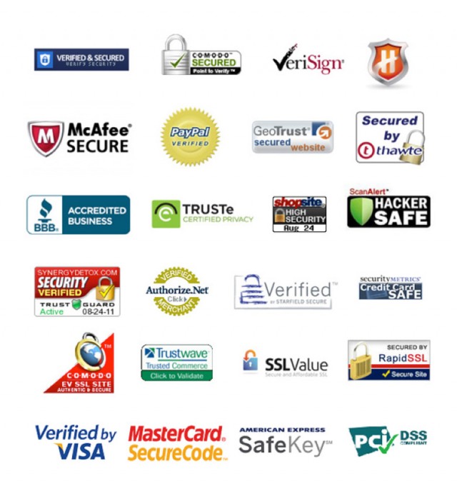
- Adding badges and ratings from professional and regulatory organizations such as the BBB
- Quotes from satisfied customers
- Endorsements from influencers
- Subscriber and social media counts
- Logos of well known clients
- Media Logos
Each of these items provides proof of quality of products and services and can significantly increase the level of trust that visitors have.

Первое впечатление очень важно! Поэтому всегда необходимо быть в курсе трендов и направлений в развитии веб-дизайна лендингов.

Тренд размещения полноэкранного видео и изображений давно используется в разных сферах бизнеса. Видео или крупное изображение лучше привлекает внимание посетителя, а главное, быстрее позволяет донести главную идею сайта.
Если на первом экране вашего лендинга присутствует видео, то посетитель вряд ли сразу нажмет кнопку «назад» в своем браузере. В качестве примера можно привести сайт Walabot
3D параллакс

Параллакс – один из главных трендов веб-дизайна в настоящий момент. Он дает ощущение объема, когда посетитель просматривает вашу страницу. Такой гигант, как Sony, использовал этот эффект, чтобы удивлять посетителей, пока рассказывал о своем бренде.
Навигация всегда должна стремиться быть наиболее удобной для посетителя. Но при этом нет ничего плохого в том, чтобы пробовать разные способы отображения скроллинга.
Отсутствие навигационного меню

Меню, конечно, делает навигацию более простой и понятной для посетителей сайта. Им становится проще найти то, что они ищут. Но удаление навигационного меню или изменение его вида заставят ваших гостей проводить больше времени на вашем ресурсе.
Это поможет им не отвлекаться на разные навигационные иконки, при этом концентрируясь на теме сайта.
Предельное упрощение дизайна

Этот тренд появился, чтобы остаться надолго. Простота в использовании – ключ к успеху, правильно?
Хотя существует много других способов привлечение внимания, о которых было сказано выше, простота дизайна позволит максимально сконцентрировать внимание ваших гостей.
Разделенный экран

Часто сайт имеет разные целевые аудитории и лучший способ донести идею – разделить экран. Хороший пример – лендинг Muck’s Rack’s, который разделил экран для маркетологов и блоггеров.
Доказательства надежности компании

Перед тем как принять решение обычно человек хочет выяснить опыт взаимодействия с компанией других людей или организаций.
Единственный минус этого заключается в том, что меньшее чего хотела бы компания, на сайте которой находится человек, это чтобы он перешел по ссылке на другой сайт.
Меню-гамбургер

Все больше дизайнеров используют этот вид меню, чтобы включить как можно больше информации на засоряя лендинг.